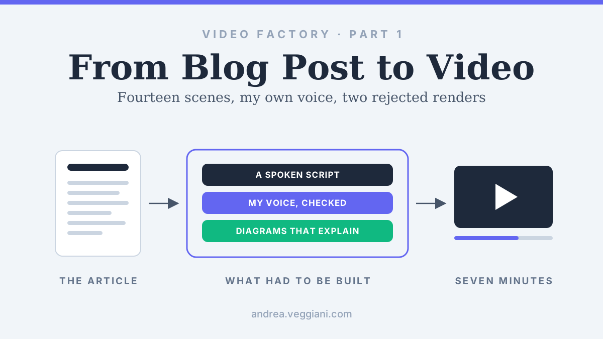
Part 1 of three articles on building my video factory. This part covers the first pilot, the technology choices and the work needed to make the narration and the diagrams worth watching.
The first complete video of my CDP article had the right dimensions, an audio track in a recognisable version of my voice, and enough moving elements to qualify as an animated explanation. I rejected it. The next version had 95 visual beats aligned to the narration, which sounds like a substantial improvement when you read it in a production report. I rejected that one too.
Both files played correctly, yet neither of them explained the architecture well enough for someone who had not read the article.
That is where the useful story of this project begins, because making an article become a video turned out to involve several different kinds of work, and generating the file only answered one of them. The factory became useful when we could define a good explanation clearly enough to reproduce it.
The next thing I wanted to build from this site
The site began in March as a way to publish my writing and get back to building, and since then I have written about what changed when AI assistants started producing working artifacts and about keeping that collaboration running from one month to the next. By August I had a set of architecture articles whose arguments already belonged together, and I wanted to carry them into video without starting a separate editorial operation.
The Architecture Behind the Acronyms was a good place to begin. These pieces explain what a category originally solved, how its boundaries moved, and which architectural requirement survives after the label becomes ambiguous: data flows and ownership boundaries that a diagram can show, and changes to them that motion can make easier to follow.
We started with the CDP article, whose finished video is public on YouTube if you would rather watch it before reading how it was made, then continued with DMP and CEP. Throughout this piece, “we” means three parties: I set the editorial direction and made every approval decision, while Codex and Claude Cowork turned those decisions into scripts, code and production files. How that division of work held up is the subject of the second part, because the first problem was deciding what we were asking them to produce.
An article needs a new script before it becomes a video
The CDP article argues that a trusted customer profile remains necessary even when its physical home changes. A packaged platform, a warehouse-centred architecture and an engagement suite can all claim part of that territory. Reading the article aloud would preserve the words, but it would leave the viewer doing much of the reconstruction that a reader can do by pausing over a paragraph.
The video therefore began with a creative brief. It proposed a searchable title, a hook, the order of the argument and a thumbnail direction. The question “What Does a CDP Actually Do?” gave us a clear entry point into an answer that was more architectural than a definition.
From that brief we produced a spoken script and fourteen scenes. Each scene needed a job: establish the ownership problem, explain the category’s appeal, show the warehouse turn, or distinguish the CDP from adjacent layers. That forced decisions about which examples deserved time and which belonged in the original article for readers who wanted the detail.
There was also a fact-refresh step, because an article written earlier in the year could carry an acquisition example or an analyst description that needed rechecking before it became a video.
The storyboard connected that editorial work to production. It held the narration, the proposed duration and the visual action for each scene, so the text and picture had a shared reference. Estimated durations helped us plan, but the generated narration later supplied the actual timing, which became essential once the diagrams had to change at particular points in a sentence.
Why Remotion fitted architecture videos
We used Remotion to build the video. It lets you describe compositions with React, preview them in a browser and render the result into a video file. In this project, that meant the things we needed to control were available as code: the dimensions of a card, the route of a connector, the moment a label appeared and the length of time an architectural state remained visible.
For this material, that was a useful fit. The visuals were diagrams with a specific meaning. A profile needed to live inside the right boundary, a flow needed to arrive at the right destination, and moving a capability from one system to another needed to remain legible. Those are requirements we could express, inspect and revise in the composition.
The same code carried the site’s visual identity into the videos, with Outfit and Inter, dark neutral surfaces and the indigo accent. It lived in a separate project beside the Astro site, so publishing a paragraph correction never depends on the machinery that produces seven minutes of video. One distinction is worth keeping precise: Remotion describes itself as source-available under its own license, while Chatterbox and Faster Whisper are MIT-licensed open-source projects, the first generating the narration and the second checking it, and I would expect a vendor to get that difference right in a briefing.
Teaching the narration to sound like me
I wanted the videos narrated in my own voice, with generation running locally. We used Chatterbox Nano from Resemble AI, the smallest model in the family: an English-only model of about 110 million parameters designed for CPU inference, which made it the practical choice for a machine without an NVIDIA GPU.
I supplied a recording of roughly twenty seconds, trimmed to a seventeen-second reference that the model used to condition its output on my voice. We were using an existing model with a reference sample, rather than training a new voice model from scratch, and the recording stayed private. Nano support arrived after the latest packaged release, version 0.1.7, so the project pins the upstream code at a fixed revision, together with its MIT license.
The first preview was recognisable, but parts of the English were difficult to understand. The next attempt used a pronunciation dictionary, shorter text chunks and more conservative generation settings. That gave us a clearer delivery in the preview, which I preferred by ear, but the full generation exposed a different problem: most of the scene clips omitted phrases, and their combined duration reached roughly fourteen minutes against an eight-minute target.
That version could not be used, and it showed me that recognising my voice and preferring its articulation said nothing about whether every sentence of the script had survived generation.
We added an independent transcription check with Faster Whisper, using a small English model locally. The check compared the generated speech with the approved narration, looking at the amount of text recovered and how closely the word sequence matched. It gave us a way to flag likely omissions scene by scene before spending time on a render.
The replacement balanced profile kept the pronunciation dictionary but returned to the model’s default sampling settings and to longer chunks of up to 280 characters. The approved short preview ran for about 37 seconds, the transcription check recovered 96 words against the 95 in the script with a sequence similarity of 0.96, and I approved it by ear on 9 August. The complete candidate then had to clear minimum thresholds for recovered words and sequence similarity in every one of the fourteen scenes, and it did, producing around six minutes and fifty-one seconds of narration and a scene timeline of just over seven minutes.
We kept that candidate separate until it passed, so a new attempt could never silently replace the audio attached to the storyboard, and only then made it the active narration.
Speech recognition can make mistakes of its own, and a similarity score cannot decide whether a voice sounds like me or is comfortable to listen to. My listening review answered those questions, while the transcript comparison caught failures that a short preview had missed.
Local generation gave us control over the files and a reusable voice profile, and it still consumed compute, attention and review time, as the rejected fourteen-minute candidate demonstrated.
The warehouse scene that changed the visual direction
Once the narration worked, the picture became the main problem. The early template could display labels and animate cards, but long passages still looked static. Adding motion put more activity on screen, and it did little for someone trying to understand what I was saying.
The next version used word timestamps from the approved audio to align short phrases and diagram emphasis. It had those 95 visual beats, averaging about four and a half seconds each. The timing was more deliberate, but too many passages still relied on similar movements in the same part of the screen. The animation changed while the explanation remained thin.
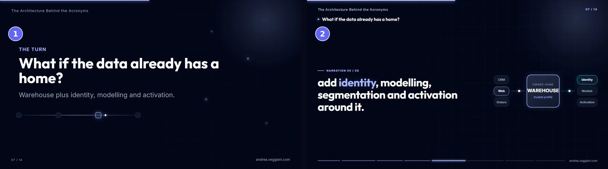
Figure 1. The same moment in the warehouse scene in the two rejected versions: the first complete render (1) and the 95-beat revision (2). The second moves in time with my voice, and the diagram still explains very little.
The breakthrough came when we reduced the problem to one 37-second warehouse scene and worked out its causal sequence one narration idea at a time, before touching anything else in the video.
Data from different sources converged into the warehouse. A separate application-owned copy appeared, making duplication visible. That copy was rejected. Capabilities assembled around the data that remained in the warehouse, reverse ETL carried profiles towards operational tools, the single CDP box was crossed out, and a capability layer settled on top of the enterprise data. By the end, the viewer could see why the capabilities might survive even when the single box became less useful as a description.
Each movement corresponded to something in the argument. The changing diagram gave the spoken explanation a visible consequence, which was the quality missing from the earlier versions.
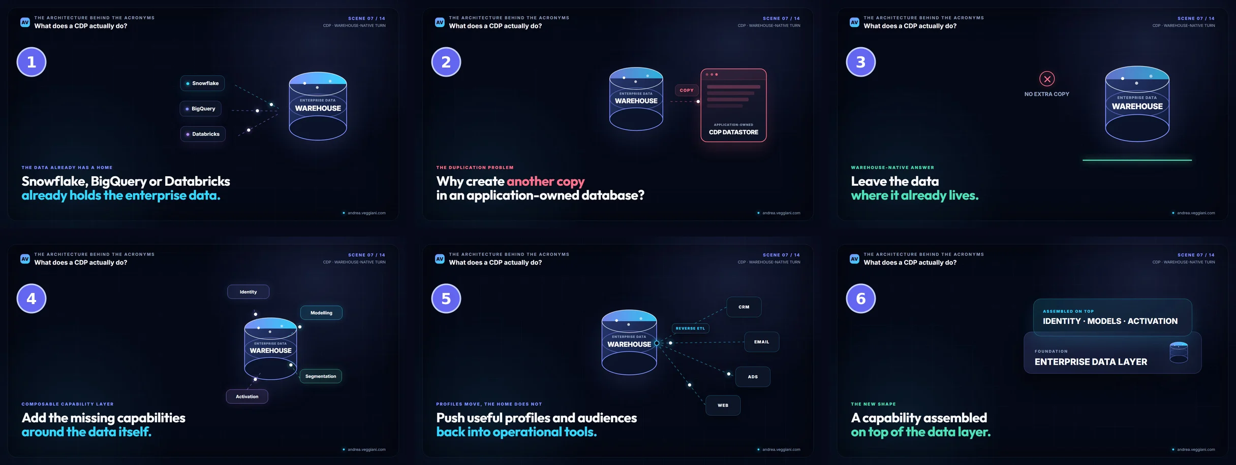
Figure 2. The warehouse scene as it shipped in the public video, in six numbered steps. Every step changes the architecture on screen, and each change is the one the narration is describing at that moment.
I approved that direction with a correction: text inside diagram symbols had to stay inside them. The warehouse needed enough internal space for its labels, and those labels had to remain readable at different scales. It was a small instruction with consequences throughout the rest of the production, because the same issue would return in cards, containers and dense comparison scenes.
The proof also showed how easily a diagram can contradict its own narration. A later review found that the panel labelled as assembled on top was being drawn underneath the foundation, so for a few seconds the picture argued the opposite of what I was saying, and nothing in the render itself would have flagged it.
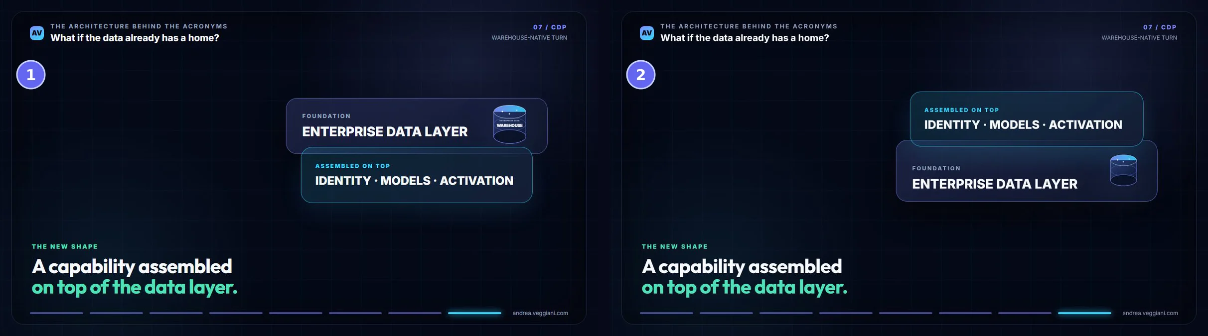
Figure 3. The closing frame of the warehouse proof before (1) and after (2) review. In the first, the panel labelled “assembled on top” sits underneath the foundation; in the second, it sits where the narration says it does.
The approved proof became the reference for the rest of the CDP video. The finished film is public on YouTube under the same title as the CDP article, runs just over seven minutes and carries the approved narration and this visual direction, and later the DMP production and a reusable editorial kit took its lessons into a more consistent structure.
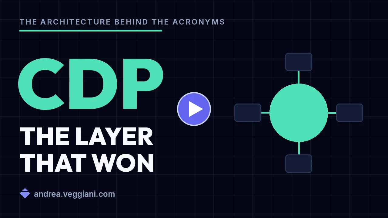
Figure 4. The finished CDP video on YouTube, 7 minutes 12 seconds including the outro.
What the first pilot established
The useful output of the pilot was larger than the first video. We had a way to adapt an article into a spoken argument, a local voice profile with a review process, and a visual direction demonstrated by a scene I had actually watched and approved.
We also had a record of what had failed. The clearer voice could lose content. More visual beats could still produce weak explanation. A diagram that looked acceptable at one size could let its labels escape at another. Each failure narrowed the next request, because we could point to a specific file, a timestamp or a label and say exactly what was wrong with it.
I recognise this from architecture work: the intended behaviour has to become explicit enough for somebody else to implement it and challenge the result. Here, that meant speaking a sentence completely and helping a viewer follow a customer profile as its architectural home changed.
The first rejected render had shown that all the parts could produce a file together. The warehouse proof showed us what was worth producing. The factory started to become repeatable when an approved example could carry more meaning than another long prompt.
Next in this set of three: Building a Video Factory with Codex and Claude Cowork, on how the work was divided between me and two AI collaborators and how each checked the other, followed by From Article to YouTube: Making the Process Repeatable, on turning one pilot into a production routine and a publishing step. Both follow in the coming weeks.
Sources
Video composition
- Remotion, Documentation. Reference for React-based video compositions and rendering.
- Remotion, License FAQ. Clarifies the distinction between source-available and open-source software.
Voice generation and checking
- Resemble AI, Chatterbox. The MIT-licensed voice-model family used by the factory, including the CPU-oriented Nano model.
- PyPI, chatterbox-tts release history. The latest packaged release, 0.1.7, predates Nano support.
- SYSTRAN, Faster Whisper. The transcription implementation used for narration checks and timing.